
Desk setup9 August 202610 min read
How to Choose a Desk Mat Design for Your Setup
Choose a printed desk mat design for work, study, or gaming by matching its colour, pattern, and crop to your desk and everyday equipment.
A desk mat covers a large part of your workspace, so its design affects how the whole setup feels. The right artwork can visually connect a keyboard, mouse, monitor, and desk that were bought at different times. A design with the wrong colour balance or pattern density can make the same equipment feel crowded.
At Lasting Details, desk mat and mousepad describe the same printed product. Every design uses the same construction and surface. You choose M, L, XL, or XXL according to your available desk space, keyboard placement, and mouse movement; there is no separate gaming mousepad product hidden elsewhere in the catalogue.
This guide uses real designs from our desk mat and mousepad collection in Pakistan to show how colour, artwork style, and crop work together for office, study, gaming, and creative setups.
Quick answer: measure the usable desk area first, then decide whether the mat should blend with the room, connect colours already present, or lead the setup as its main visual feature. The more detailed the artwork, the quieter the surrounding accessories should be.
Quick desk mat design chooser
| Your setup | Look for | Designs to compare |
|---|---|---|
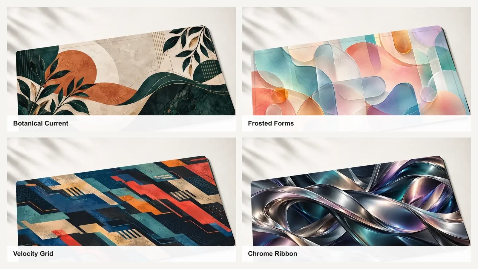
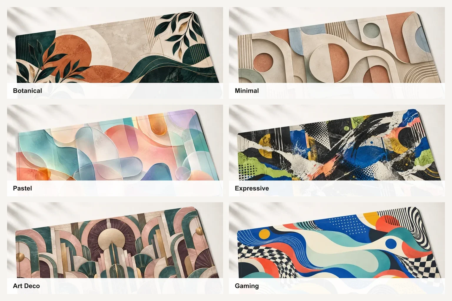
| Warm wood office | Terracotta, cream, muted green, or ordered geometry | Botanical Current, Marquetry Symmetry |
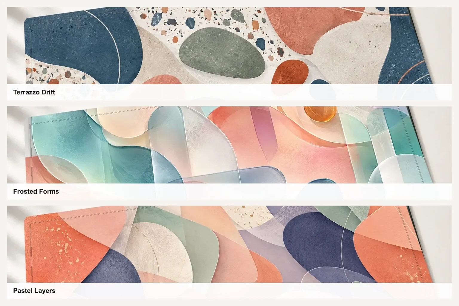
| Light study space | Open compositions, soft colour, and broad shapes | Frosted Forms, Pastel Layers |
| Calm home workspace | Natural forms, restrained contrast, or a gentle horizon | Sunlit Earthscape, Earthen Relief |
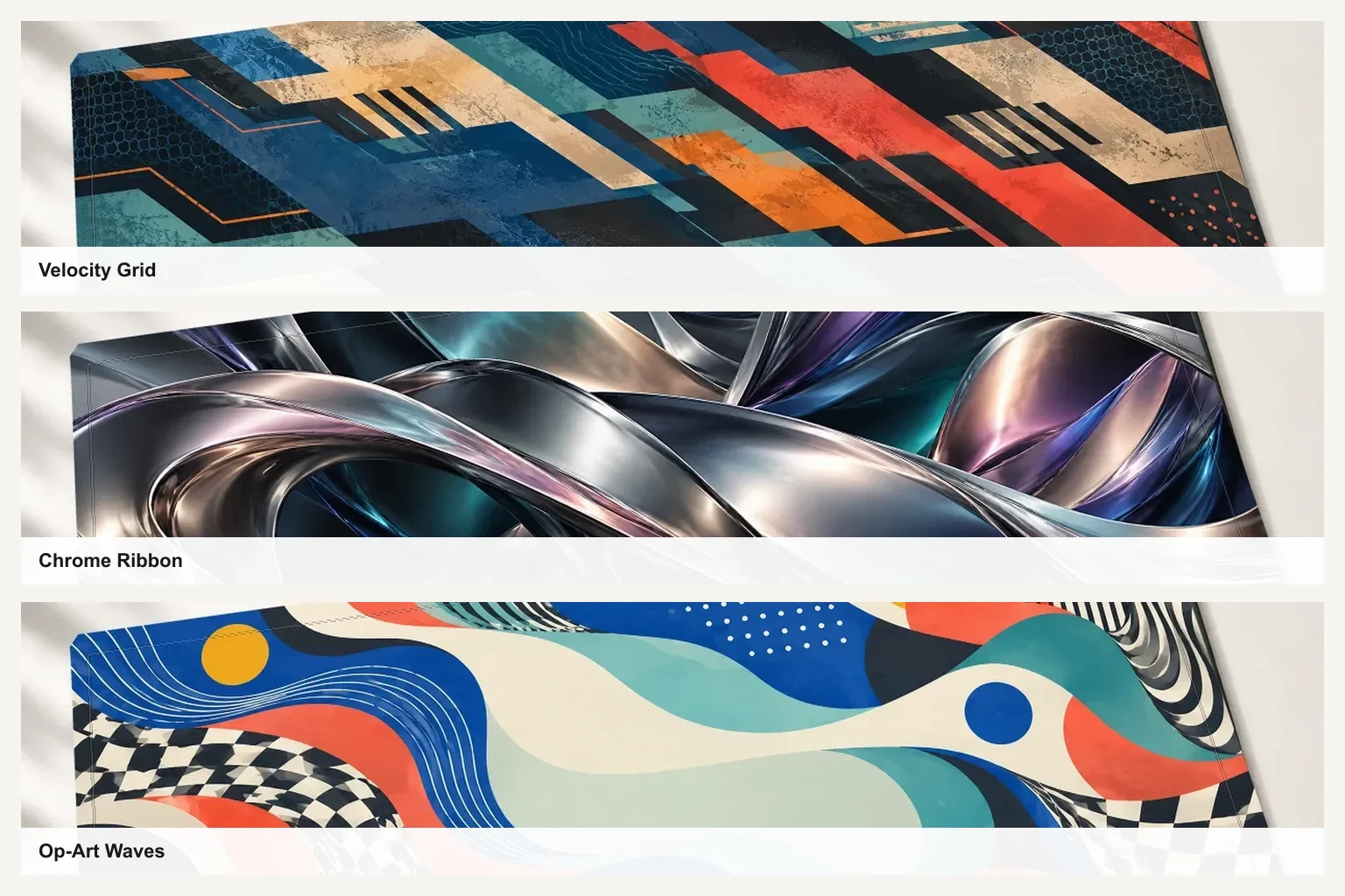
| Dark or gaming desk | Strong contrast, controlled movement, and one clear theme | Velocity Grid, Op-Art Waves |
| Creative workstation | Expressive composition with enough large forms to remain visible | Street Signal, Organic Rhythm |
Choose the role of the desk mat first
Before choosing a colour or pattern, decide what the mat should do visually. There are three useful roles:
- Blend in: choose a restrained design that organises the desk without becoming the focal point.
- Connect the setup: repeat one or two colours already present in the keyboard, wall art, chair, or room.
- Lead the setup: start with a distinctive mat, then keep the keyboard, mouse, and accessories quieter around it.
Most work and study desks benefit from the first two approaches. A gaming or creative setup can comfortably let the mat lead, provided the lighting and accessories are not all competing for attention.
A five-step test before choosing a design
- Measure the usable surface. Exclude monitor stands, shelves, chargers, and any part of the desk you need for writing.
- Photograph the desk in normal light. The picture makes its dominant colours and visual clutter easier to notice.
- Choose blend, connect, or lead. This prevents you from comparing attractive designs that serve completely different purposes.
- Place the keyboard mentally. Check whether it would hide the design's only focal point or leave the composition readable.
- Judge it under your usual lighting. A mat used at night should work with your room lights switched on, not only in a bright product photograph.
Match the design to the desk colour
Start with the largest fixed surface: the desk itself. Warm wood usually works with terracotta, cream, muted green, dusty blue, and charcoal. A design such as Botanical Current connects to wood through warm neutral space while its deep teal leaves create enough separation to remain visible.
White and pale desks can support soft designs without losing their shape. Frosted Forms uses broad translucent-looking shapes and open colour, while Pastel Layers adds a little more contrast. These are useful when you want a study table mat to feel bright without becoming childish or visually loud.
For a dark desk, either create contrast with a lighter composition or commit to a darker design that has clear highlights and large forms. Avoid a near-black, low-contrast print on black furniture unless you deliberately want the mat to recede.
Coordinate the keyboard and accessories
The keyboard usually covers the centre-left area of a large desk mat, while the mouse moves across the right side. Neutral black, white, cream, and grey peripherals can sit over almost any artwork. With colourful keycaps, choose a mat that repeats one existing colour or provides a calmer background.
Do not try to match every keycap. One repeated blue, terracotta, or green accent is enough to make the setup feel related. If the keyboard is already patterned, a design such as Earthen Relief or Marquetry Symmetry can provide structure without introducing another unrelated visual language.
Choose the right pattern density
Large shapes are forgiving because they remain readable when a keyboard, laptop, or notebook covers part of the print. Fine repeated patterns can look detailed up close but become busier once equipment is added. A design with one isolated focal point is the least flexible because that focal point may disappear under the keyboard.
For a compact or already crowded desk, favour open compositions and lower contrast. For a sparse creative or gaming setup, bolder motion can give the surface a clear identity. Organic Rhythm uses broad interlocking forms; Street Signal is more layered and expressive.
Gaming desk mat ideas without visual overload
A gaming desk mat does not need a licensed character, team, car, or glowing effect to belong in a gaming setup. Original geometry, contrast, speed, and movement can establish the mood while keeping the product usable with different hardware over time.
Velocity Grid uses directional geometry and a dark base, while Op-Art Waves combines curves, checks, and brighter colour. Chrome Ribbon suits darker equipment when you want a polished-looking focal surface.
Keep the mat as the main patterned element. If the wallpaper, PC lighting, keyboard, and wall art all introduce different themes, the desk loses hierarchy. Pick one accent colour from the print for the lighting or keycaps and leave the remaining hardware neutral.
How the same artwork changes from M to XXL
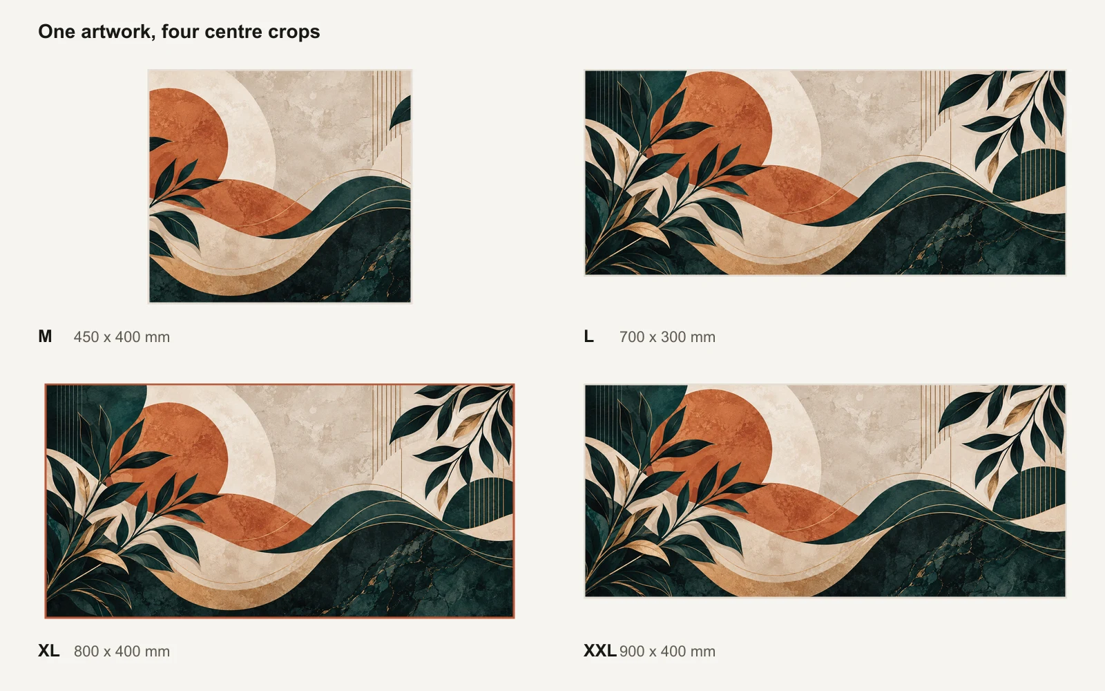
Lasting Details desk mats are available in M (450 x 400 mm), L (700 x 300 mm), XL (800 x 400 mm), and XXL (900 x 400 mm). M is much closer to square, while the other three sizes are wide. The artwork is centre-cropped for each format and never stretched, so different parts of the same original design can appear near the left and right edges.
That makes repeated patterns, broad abstract forms, and compositions with interest around the centre especially adaptable. If a particular edge detail matters to you, inspect the selected-size preview before ordering. Use the complete M, L, XL, and XXL size guide to choose the physical fit before deciding which crop you prefer.
Choose by how you use the desk
- Work: choose controlled contrast and a design you can look at for long periods. Botanical Current, Earthen Relief, and Marquetry Symmetry are useful starting points.
- Study: favour open, calm artwork that separates the study zone from the rest of a bedroom without demanding attention. Compare Frosted Forms, Pastel Layers, and Sunlit Earthscape.
- Gaming: use stronger movement or contrast, but keep one visual theme. Velocity Grid, Op-Art Waves, and Chrome Ribbon can lead the palette.
- Creative work: expressive designs can make a sparse workstation feel intentional. Street Signal and Organic Rhythm retain visible large forms beneath equipment.
Understand what printed effects look like
Some artwork may depict chrome, glass, gold, texture, or glow. These are visual elements printed onto the fabric surface. They are not metallic ink, foil, embossing, a raised material, or emitted light. For example, Chrome Ribbon creates its depth through printed highlights and colour rather than a reflective metal layer.
Screen previews are also backlit, while a finished desk mat reflects the light in your room. Very bright screen colours will therefore look more grounded in print. Product images should help you judge the composition and approximate palette, but room lighting and screen calibration still affect colour appearance.
Practical colour choices for daily use
Light colours show tea, coffee, dust, and ink marks sooner. Dark mats conceal some marks but can show pale dust. Neither is maintenance-free, so choose based on what you will be comfortable cleaning rather than assuming one colour always stays looking new.
Medium-value, patterned artwork is often the most forgiving for everyday visual marks because no single light or dark area dominates. Whichever colour you choose, follow the printed desk mat cleaning guide rather than using harsh cleaners or aggressive scrubbing.
Common mistakes to avoid
- Choosing the design before measuring the usable desk depth and width.
- Matching every accessory to the mat instead of repeating one accent.
- Using several unrelated themes across the mat, wallpaper, lighting, and wall art.
- Picking a detailed focal design that the keyboard will completely cover.
- Expecting printed chrome, gold, glass, or glow to behave like a special physical finish.
- Assuming the artwork will look identical at M and XXL despite their different proportions.
Desk mat design questions
What colour desk mat looks best on a wooden desk?
Warm wood works naturally with olive, cream, terracotta, sand, charcoal, and muted green. Choose earth tones when you want the mat to blend in, or use a darker navy or charcoal design when you want clearer contrast. The wood does not need an exact colour match.
Should a desk mat match the keyboard?
It should coordinate rather than match exactly. Keep most keycaps neutral and repeat one small colour from the artwork in an accent key, cable, or nearby object. This creates a relationship without making the setup look like a pre-packaged set.
Is a desk mat different from a mousepad?
Not in the Lasting Details catalogue. Desk mat and mousepad are two names for the same printed product and surface. The different M, L, XL, and XXL sizes simply let you choose whether the mat sits mainly under the mouse or extends beneath more of the keyboard and desk.
Is a light or dark desk mat more practical?
Light mats make a workspace feel open but show dark spills and marks sooner. Dark mats disguise some marks but make pale dust and fibres more visible. Choose the look you prefer and the cleaning routine you can maintain; neither colour removes the need for regular care.
Where should the main part of the design sit?
Keep the most important detail away from the area your keyboard permanently covers. A centre-weighted design can still work when the focal point extends above and around the keyboard. Broad abstract designs and repeated patterns are the most forgiving for changing layouts.
What desk mat size is best for a full-size keyboard?
XL at 800 x 400 mm is the strongest all-round starting point, while XXL at 900 x 400 mm provides more room beside a full-size keyboard for wider mouse movement. Measure the actual desk before deciding because monitor stands and shelves reduce the usable depth. See the complete desk mat size and price comparison.
Which desk mat design should you choose?
For the most versatile result, choose broad shapes, a limited palette, and enough contrast to remain visible beneath your equipment. Choose botanical or earth-led artwork for a softer work or study space. Let a bold abstract design lead a gaming or creative setup, then keep the surrounding accessories quieter.
The best desk mat design is one that fits the desk you already own and remains comfortable to see every day. Browse all ready-made desk mat and mousepad designs in Pakistan. If you already have your own artwork, photograph, or brand design, use the custom desk mat printing builder and review the custom artwork preparation guide before uploading.
Next step
Turn the guide into a finished piece.
Use the guide to pick a ready design, or send your own artwork for studio review before production.