
Wall art18 July 20264 min read
Bedroom wall art ideas: what to hang above the bed
How to choose calm, well-scaled bedroom wall art, get the height right above a bed, and avoid the mistakes that make a room feel busy.
A bedroom is the one room where wall art should not compete for attention. It is the last thing you look at before sleeping and the first thing you see waking up, which makes it a poor place for anything visually loud. The goal is a room that feels settled.
That single idea drives almost every decision below.
Start with the wall above the bed
The wall behind the bed is the natural focal point, and it is where most bedrooms either work or fall apart. The bed is already the largest object in the room, so art placed above it has to relate to the bed rather than float independently.
Two arrangements reliably work:
- One larger piece, centred. The cleanest option. Aim for a print roughly two thirds the width of the bed. Above a queen bed that means A1 or a large A2. Anything smaller looks stranded on the wall.
- A pair, side by side. Two matching A3 or A2 prints with a consistent 5 to 8 cm gap. This suits a wider wall and feels more deliberate than three or more pieces, which start to get busy directly above a sleeping area.
Whichever you choose, centre the arrangement on the bed, not on the wall. If a wardrobe or door means the bed is off-centre in the room, the art still follows the bed. Your eye reads the bed and art as one unit.
Get the height right
Above a bed, forget the standard eye-level rule. Measure from the headboard instead. Leave roughly 15 to 25 cm between the top of the headboard and the bottom of the print.
Too much gap and the art appears to drift toward the ceiling. Too little and it feels cramped, and you risk knocking it when sitting up against the headboard. If you do not have a headboard, work from the top of the mattress and add a little more clearance.
Choose colours that settle the room
Bedrooms suit a narrower, warmer palette than living areas. Soft, low-contrast artwork reads as restful; high-contrast, high-saturation work reads as energetic, which is the opposite of what the room is for.
Practical directions that work well:
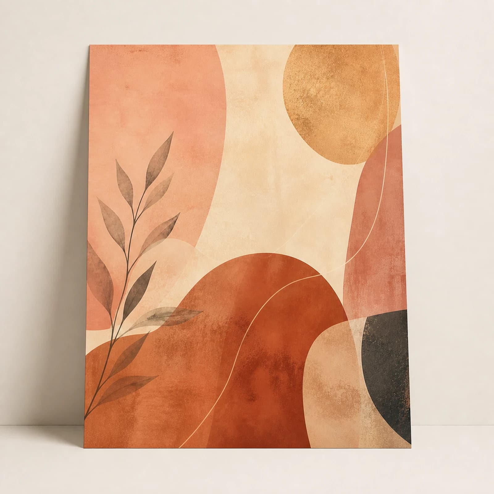
- Warm neutrals. Clay, sand, terracotta, and cream tones feel calm without being cold. These work in almost any bedroom and date slowly.
- Soft botanicals and line art. Light, airy, and easy to live with. Good for bedrooms that already have a lot going on with bedding and curtains.
- Muted greens and deep blues. Nature-referencing tones that feel restful. Effective if your bedding is neutral and you want the art to carry the colour.
Pull one colour from something already in the room, such as bedding, a rug, or curtains, and let the art echo it. That single repetition is what makes a room look considered instead of assembled.
Matte or gloss?
For bedrooms, matte is usually the better choice. It diffuses light rather than reflecting it, which matters when a bedside lamp or a window sits opposite the wall. Gloss is punchier and makes colour pop, but in a room with a lamp near the art, reflections can be distracting from the bed.
If the wall opposite the bed gets strong daylight, a Matte sample is usually the safer starting point for controlling reflections.
Small bedrooms and shared rooms
In a small bedroom, resist the urge to fill every wall. One well-scaled piece above the bed and nothing else will make the room feel larger than four small prints spread around it. Empty wall is a design element, not a gap to fill.
For a shared bedroom, the pair arrangement above the bed is a practical way to reflect two tastes without the wall becoming an argument. Two prints that share a palette but differ in subject read as intentional.
Other bedroom walls worth using
The wall facing the bed is underused. It is what you actually look at while lying down, so it suits a piece you genuinely enjoy rather than one chosen only to match the bedding.
A dressing area or the wall above a chest of drawers works well for a single smaller print in A4 or A3. Keep it in the same palette as the main piece so the room stays coherent.
Mounting above a bed
Anything hanging above where someone sleeps needs extra care. Confirm the mount is rated for the print, wall surface, and position; follow its preparation and curing instructions; and inspect it periodically. Magnetic mounting can make a metal print easier to remove for cleaning or repainting, but it still requires a secure wall-side mount.
For a full walkthrough of drill-free options and their limitations, see our guide on hanging wall art without drilling. If you are still deciding on scale, the size guide has the measurements.
Next step
Turn the guide into a finished piece.
Use the guide to pick a ready design, or send your own artwork for studio review before production.