
Wall art16 July 20264 min read
Living room wall art: how to style the wall above your sofa
The sizing rule for art above a sofa, when to choose one large print over a gallery wall, and how to make a living room wall feel finished.
The wall above the sofa is the most visible wall in most homes and the one people get wrong most often. It is usually either left bare because the wall feels intimidating, or filled with prints that are individually nice but collectively too small.
The fix is almost always about scale.
The two thirds rule
Art above a sofa should span roughly two thirds of the sofa's width. This single guideline solves most living room wall problems.
For a standard three-seater of about 210 cm, that means an arrangement around 140 cm wide. A single A1 print gets you a strong focal point; two A2 prints side by side cover the span with a little more flexibility. A lone A3 above a three-seater, by contrast, will always look undersized no matter how good the artwork is.
Measure your sofa before choosing a size. It takes a minute and it is the difference between a wall that looks styled and one that looks unfinished.
One statement piece or a gallery wall?
Both work. They suit different rooms.
A single large piece is the stronger default. It is calmer, easier to get right, and reads as more considered. It suits rooms that already have visual activity, such as patterned rugs, busy shelving, or a lot of furniture, because it gives the eye somewhere to rest. It is also far more forgiving: one piece, centred, at the right height, and you are finished.
A gallery wall suits large blank walls, rooms with simple furniture, and people who want to add to the collection over time. It takes more planning to look deliberate rather than accumulated. If you want to go this route, our guide on planning a gallery wall covers layout and spacing properly.
If you are unsure, choose the single piece. A gallery wall done poorly looks cluttered; a large print done simply rarely looks wrong.
Height above a sofa
Leave 15 to 25 cm between the top of the sofa back and the bottom of the print. As with a bed, the art should relate to the furniture rather than to the ceiling.
The most common error is hanging too high, which visually disconnects the art from the sofa and leaves an awkward band of empty wall between them. If in doubt, go slightly lower than instinct suggests.
Centre the arrangement on the sofa, not the wall. If the sofa sits off-centre because of a door or window, the art follows the sofa every time.
Choosing the artwork itself
Living rooms tolerate more visual energy than bedrooms, which opens up options. A few directions that work:
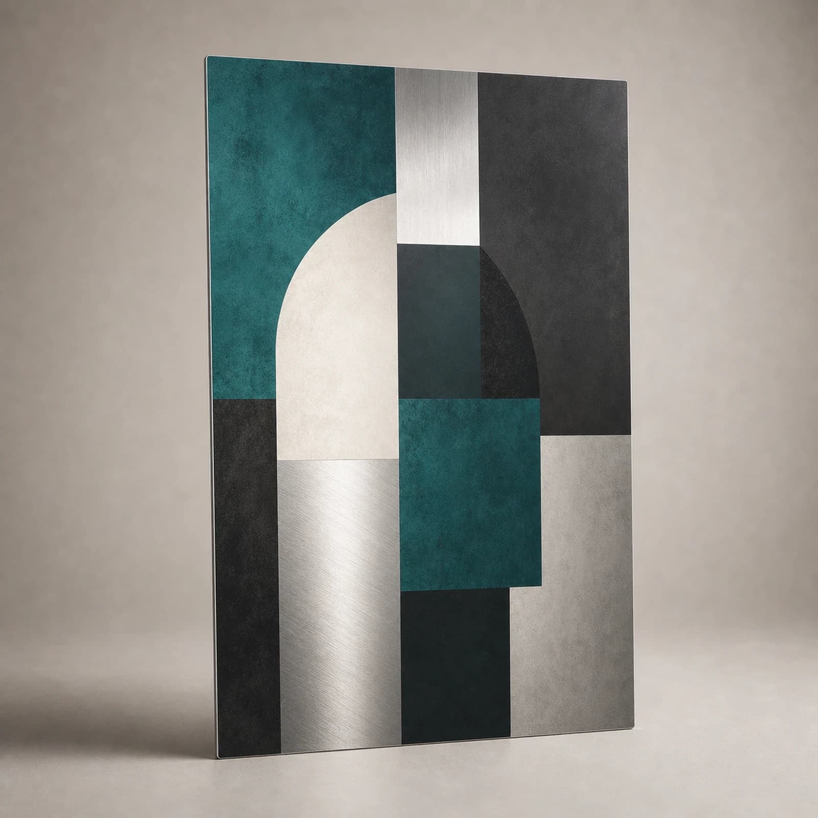
- Bold abstract or geometric work. Strong shapes hold their own at large sizes and suit modern furniture. This is where a statement piece earns its place.
- Warm, movement-led abstracts. Flowing forms in clay, amber, or muted tones make a formal living room feel more relaxed.
- Monochrome and minimal. If your living room already has strong colour in the sofa, rug, or curtains, restrained artwork prevents the room from becoming loud.
A reliable trick: pick up a colour that already appears somewhere in the room but is not dominant, and let the artwork amplify it. That is what makes a scheme feel joined-up rather than matched.
Metal or paper for a living room?
Living rooms usually get the most daylight in the house, which makes this a practical decision rather than only an aesthetic one.
Metal gives a thin, rigid, frameless presentation that suits contemporary rooms. Actual colour and reflection depend on the print process and selected finish, so judge Matte and Gloss from physical samples rather than a screen mockup.
Paper is softer and warmer, sits naturally in traditional or layered interiors, and is easy to frame if you want a heavier, more classic presence on the wall.
For a bright room with a window opposite the wall, matte in either material will control glare far better than gloss. Our metal versus paper comparison goes into the differences in more detail.
Other living room walls
Once the sofa wall is settled, the rest of the room is easier. A narrow wall beside a doorway suits a single tall A2 or A1. The wall above a console or TV unit works with a smaller piece or a horizontal pair, kept low enough to relate to the furniture below it.
Resist decorating every wall. One strong wall and one supporting wall is usually the point where a living room looks complete. Beyond that, rooms start to feel restless.
Before you commit
Cut newspaper or wrapping paper to the exact print size and tape it above the sofa. Leave it for a day and look at it in daylight and in the evening with the lamps on. Almost everyone adjusts the height at least once, and doing it with paper costs nothing.
When you are ready to mount, our guide to hanging without drilling covers doing it cleanly, including on rented walls.
Next step
Turn the guide into a finished piece.
Use the guide to pick a ready design, or send your own artwork for studio review before production.