
Desk setup9 August 20269 min read
How to Choose a Desk Mat Design for Your Setup
Match a desk mat to your desk, keyboard, room, and daily routine with practical ideas for minimal, botanical, gaming, and creative setups.
A desk mat covers more visual space than almost anything else on a workspace, so its design changes the whole setup. The right one can make a mixed keyboard, mouse, laptop, and desk feel connected. The wrong one can make even good equipment look busy.
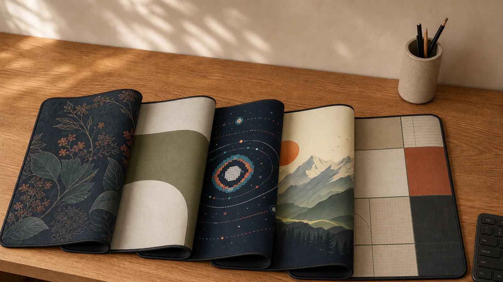
This guide explains how to choose a desk mat design for a work desk, study table, or gaming setup. It uses real designs from the Lasting Details desk mat collection, but the method works whether you prefer minimal geometry, botanical artwork, landscapes, or darker gaming styles.
Short answer: choose the size from your usable desk space first. Then decide whether the mat should blend in, connect colours already in the room, or become the main visual feature. Keep the keyboard and mouse neutral when the artwork is detailed.
Choose the role of the desk mat first
Before choosing a colour or pattern, decide what the mat should do visually. There are three useful roles:
- Blend in: choose a restrained design that organises the desk without becoming the focal point.
- Connect the setup: repeat one or two colours already present in the keyboard, wall art, chair, or room.
- Lead the setup: start with a distinctive mat, then keep the keyboard, mouse, and accessories quieter around it.
Most work and study desks benefit from the first two approaches. A gaming or creative setup can comfortably let the mat lead, provided the lighting and accessories are not all competing for attention.
A five-step test before choosing a design
- Measure the usable surface. Exclude monitor stands, shelves, chargers, and any part of the desk you need for writing.
- Photograph the desk in normal light. The picture makes its dominant colours and visual clutter easier to notice.
- Choose blend, connect, or lead. This prevents you from comparing attractive designs that serve completely different purposes.
- Place the keyboard mentally. Check whether it would hide the design's only focal point or leave the composition readable.
- Judge it under your usual lighting. A mat used at night should work with your room lights switched on, not only in a bright product photograph.
Quick desk mat style guide
| Setup | Design direction | Good starting choices |
|---|---|---|
| Warm wood office | Olive, cream, terracotta, or structured grid | Olive Arch, Coffee Grid |
| Dark desk or black hardware | Charcoal, deep green, or controlled colour accents | Charcoal Waves, Midnight Garden |
| Light study space | Airy floral, calm landscape, or soft minimal pattern | Sakura Mist, Mountain Dawn |
| Gaming setup | Dark base with one clear visual theme | Pixel Orbit, Aurora Lines |
| Creative workspace | Topographic, abstract, or geometric movement | Monsoon Map, Sunset Blocks |
Minimal and geometric desk mats
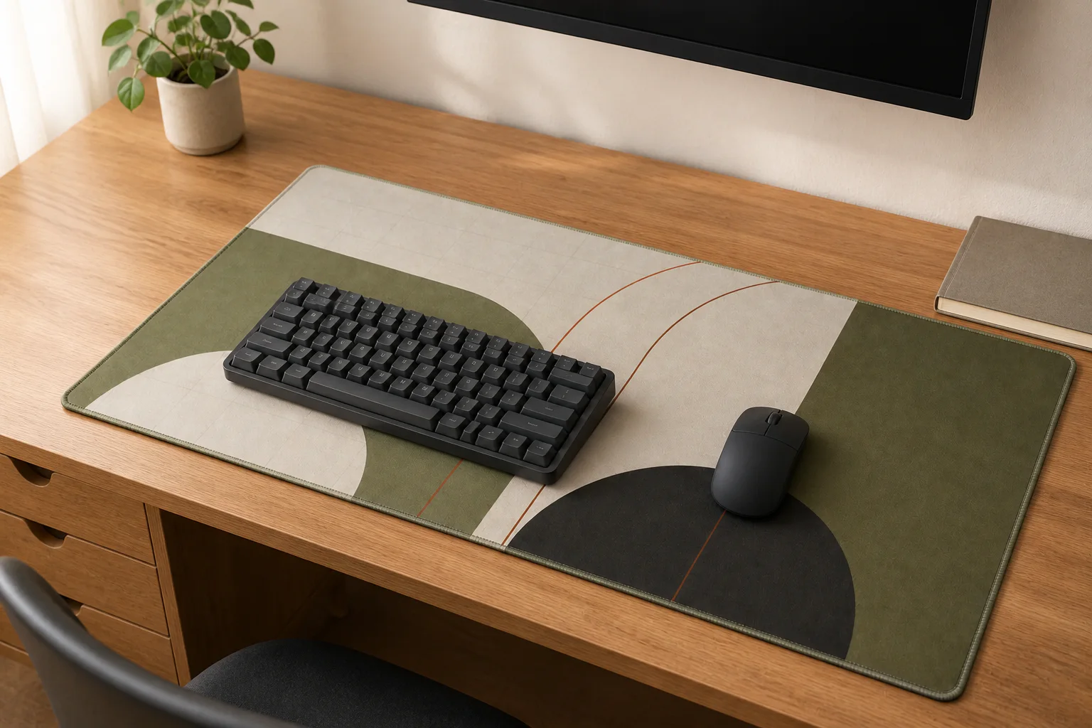
A simple desk mat is the easiest option when the desk already contains several objects, visible cables, colourful keycaps, or a busy wall behind it. Minimal does not have to mean plain black. Large shapes, grids, and limited palettes add structure without creating visual noise.
For a natural wood desk, muted olive and warm ivory sit comfortably with the grain. Olive Arch works this way: its broad shapes are visible from across the room, but the pattern is quiet around the keyboard and mouse. For a more organised office look, Coffee Grid uses warm blocks and fine grid lines without pretending to be a measuring surface.
On a black, white, or grey desk, Charcoal Waves creates a restrained monochrome base. Small warm accents stop it from feeling flat, while the darker surface lets most keyboard colours sit on top cleanly.
Botanical desk mats
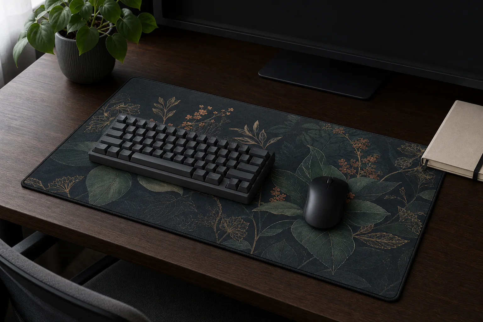
Botanical patterns soften desks dominated by screens, plastic, and metal. They are especially effective in bedrooms, reading corners, home offices, and study spaces where the desk needs to belong to the room rather than look like a separate workstation.
Choose the mood before choosing the flower or leaf. Midnight Garden has a deep green-charcoal base for darker furniture and mature interiors. Sakura Mist is lighter and more open, so it suits pale desks and gift-ready study setups. If your desk already has plants, repeat the green family rather than trying to match the exact leaf colour.
Detailed botanical artwork looks best when the keyboard does not cover its only focal point. Review the product preview and consider where your keyboard normally sits before choosing the size.
Scenic and nature-led desk mats
Landscape designs work well on wide desk mats because the horizontal format gives a scene room to unfold. They can bring calm to a study or work setup without relying on a real landmark or branded subject.
Mountain Dawn uses a light sky and layered peaks, making it a strong choice for warm wood and lighter rooms. Monsoon Map is more abstract: topographic lines and darker layers suit creative desks where you want movement without a literal scene.
If the mat will sit under a monitor shelf, check how much of the top edge remains visible. A design with interest across the full surface is more forgiving than one that depends on a single central subject.
Gaming desk mat designs without visual overload
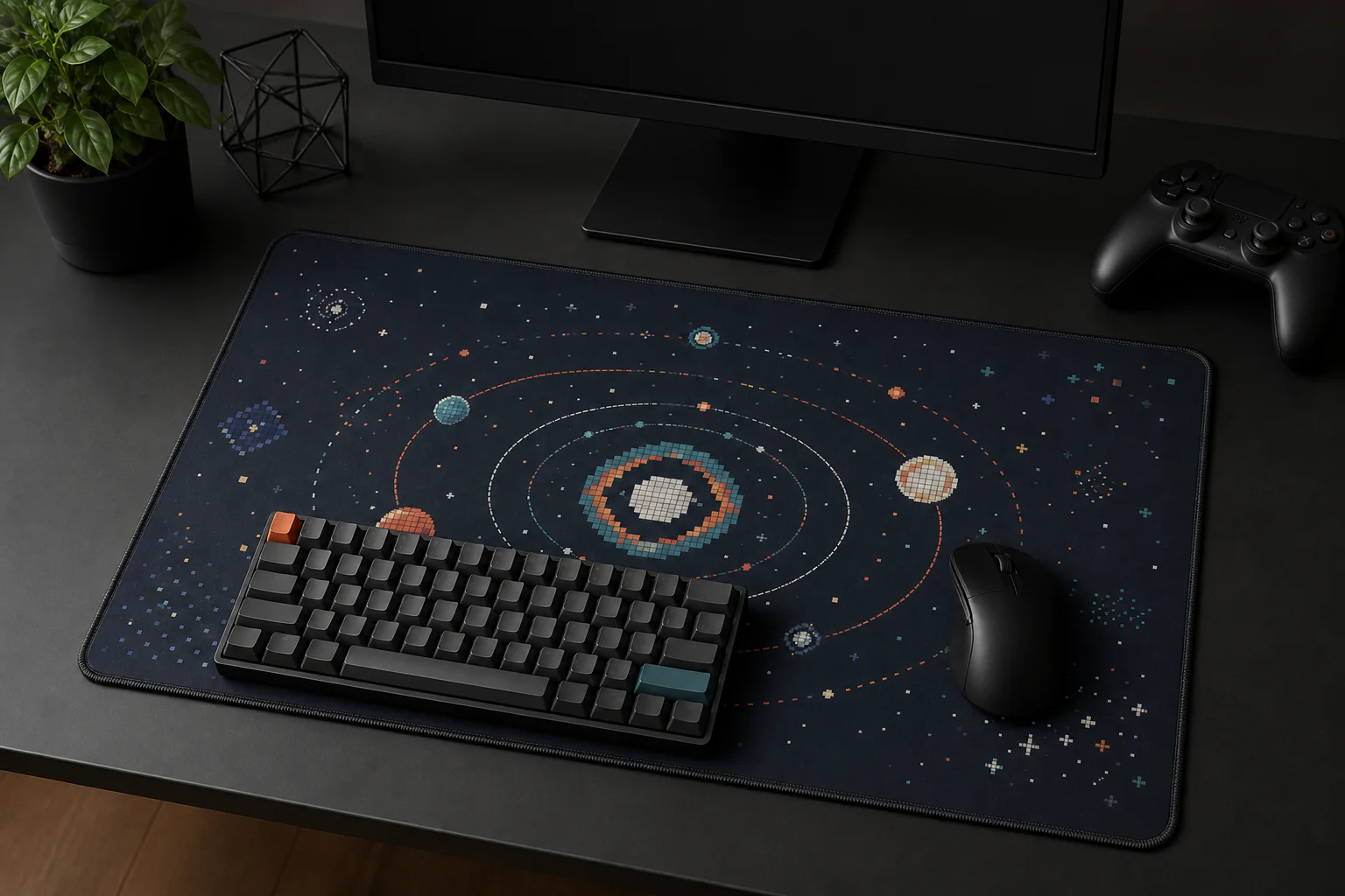
A gaming mat does not need licensed characters or aggressive RGB effects to feel connected to a gaming setup. An original visual language, such as pixel art, orbital geometry, circuitry, or flowing colour, can establish the theme while leaving room for the hardware.
Pixel Orbit works with dark cases, black peripherals, and restrained cyan or warm lighting. Aurora Lines adds more movement for creative and gaming desks, while keeping the colours printed and grounded rather than simulating emitted light.
Use the mat as the main patterned surface. If the keyboard, wallpaper, PC lighting, and wall art all carry different themes, the setup becomes harder to read. Repeating one accent colour is enough; exact matching is not necessary.
Match the mat to the desk and keyboard
Start with the largest fixed colours: the desk surface, keyboard case, and monitor. Then choose one of these simple relationships:
- Light desk, dark mat: creates a clear focal area and hides everyday marks more readily.
- Light desk, light mat: feels open and calm, but needs more regular spot cleaning.
- Dark desk, dark mat: gives a seamless studio or gaming look; use visible linework so the mat does not disappear.
- Warm wood, earth tones: olive, terracotta, sand, cream, and muted charcoal usually feel naturally connected.
For keycaps, pull one small accent from the artwork rather than matching every colour. A terracotta escape key on a mat with a small terracotta detail often looks more intentional than a full keyboard in the same colour.
Pattern scale matters
Fine patterns look detailed up close but may become visually busy under a full-size keyboard. Large geometric shapes remain readable even when equipment covers part of the mat. Scenic artwork sits between the two: it needs enough open width for the composition to make sense.
This is also why the same design can feel different at M and XXL. M is almost square at 450 x 400 mm, while L, XL, and XXL become progressively wider. Choose the physical fit first using the M, L, XL, and XXL size guide, then judge how the artwork works within that format.
Practical choices for daily use
Light colours show tea, coffee, dust, and ink marks sooner. Dark mats conceal some marks but can show pale dust. Neither is maintenance-free, so choose based on what you will be comfortable cleaning rather than assuming one colour always stays looking new.
Printed fabric also reflects light rather than producing it. Very bright screen colours and simulated neon will look more grounded in print. That is normal, and it is why realistic product previews matter. For upkeep, follow the printed desk mat cleaning guide.
Common mistakes to avoid
- Choosing the design before measuring the usable desk depth and width.
- Matching every accessory to the mat instead of repeating one accent.
- Using several unrelated themes across the mat, wallpaper, lighting, and wall art.
- Picking a detailed focal design that the keyboard will completely cover.
- Expecting printed fabric to glow like a backlit screen.
Desk mat design questions
What colour desk mat looks best on a wooden desk?
Warm wood works naturally with olive, cream, terracotta, sand, charcoal, and muted green. Choose earth tones when you want the mat to blend in, or use a darker navy or charcoal design when you want clearer contrast. The wood does not need an exact colour match.
Should a desk mat match the keyboard?
It should coordinate rather than match exactly. Keep most keycaps neutral and repeat one small colour from the artwork in an accent key, cable, or nearby object. This creates a relationship without making the setup look like a pre-packaged set.
Is a light or dark desk mat more practical?
Light mats make a workspace feel open but show dark spills and marks sooner. Dark mats disguise some marks but make pale dust and fibres more visible. Choose the look you prefer and the cleaning routine you can maintain; neither colour removes the need for regular care.
Where should the main part of the design sit?
Keep the most important detail away from the area your keyboard permanently covers. A centre-weighted design can still work when the focal point extends above and around the keyboard. Wide scenic designs and repeated patterns are the most forgiving for changing layouts.
What desk mat size is best for a full-size keyboard?
XL at 800 x 400 mm is the strongest all-round starting point, while XXL at 900 x 400 mm provides more room beside a full-size keyboard for wider mouse movement. Measure the actual desk before deciding because monitor stands and shelves reduce the usable depth. See the complete desk mat size and price comparison.
Which desk mat design should you choose?
For a safe, versatile workspace, start with minimal geometry or a restrained grid. For a softer room, choose botanical artwork. For a calm study setup, try a landscape. For gaming, use one original dark theme and let the mat lead the palette.
The best design is the one that works with the desk you already own and remains comfortable to look at every day. Browse all ready-made desk mat designs in Pakistan, or use the custom desk mat builder when you already have artwork you want to print.
Next step
Turn the guide into a finished piece.
Use the guide to pick a ready design, or send your own artwork for studio review before production.