
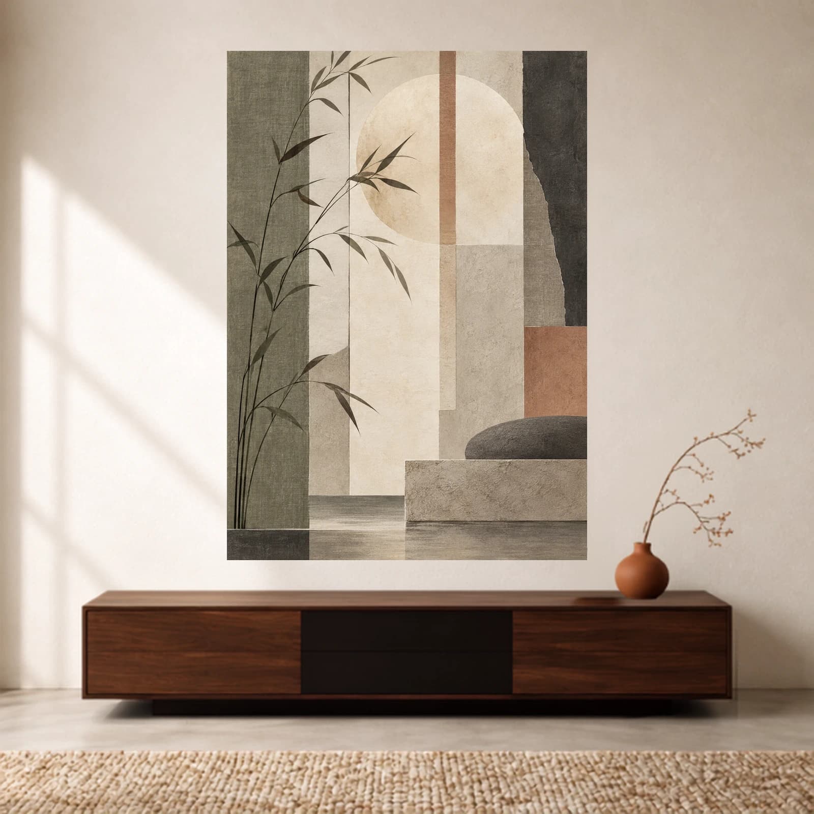
Wall art28 October 20269 min read
Japandi Wall Art: Texture, Moon or Botanical Prints?
Compare three real print designs by pattern, colour and detail, then choose the size and presentation that work with your room.
A Japandi-inspired room can accommodate more than pale abstract shapes. A graphic arrangement of wood-like lines, a moon-shaped focal point and a green botanical scene each create a different kind of wall display. The useful question is which one works with the furniture, patterns and colours already in your room.
For a quick shortlist: compare architectural texture when you want structure, a moon-and-branch composition when you want a clear focal shape, and botanical artwork when you want a recognisable natural subject. Then check the amount of detail, the complete display size and the presentation you will actually order.
This guide compares three Lasting Details designs available as UK paper prints. The images are styled digital catalogue previews, not photographs of physical samples or customers’ homes. Our recommendations come from comparing their visible compositions; they are not claims from a hands-on print test.
What does Japandi mean for wall art?
Japandi is a contemporary interior label combining Japanese and Scandinavian influences. IKEA Japan’s introduction to the style describes this combination through natural materials, restrained colour and uncluttered arrangements. For a print, those ideas are useful starting points rather than a checklist that every artwork must pass.
A beige palette alone does not tell you how busy a picture will look. Repeated lines, strongly separated shapes and detailed foliage can all attract attention even when their colours are muted. Equally, a print with green or blue can work in a restrained room if its subject and surrounding objects feel balanced to you.
Japanese art is much broader than a single interior trend. A contemporary Japanese-inspired catalogue design is not automatically a traditional Japanese print, a handmade object or an artwork produced in Japan. Choose it for its visible design and accurate product description, rather than assuming an origin or technique from the style name.
Compare three actual print styles
| Design | Main visual feature | What to compare in your room |
|---|---|---|
| Japandi Textures | Vertical slats, overlapping planes and a small lattice detail | Other repeated lines, especially wall panelling or striped textiles |
| Japandi Moonlight | A pale circular form, dark branches and layered blocks | The balance between a curved focal shape and angular furniture |
| Bamboo Quiet | A detailed green bamboo scene with strong vertical stems | Whether you want a fuller natural scene or a more open composition |
Japandi Textures: structure without lettering
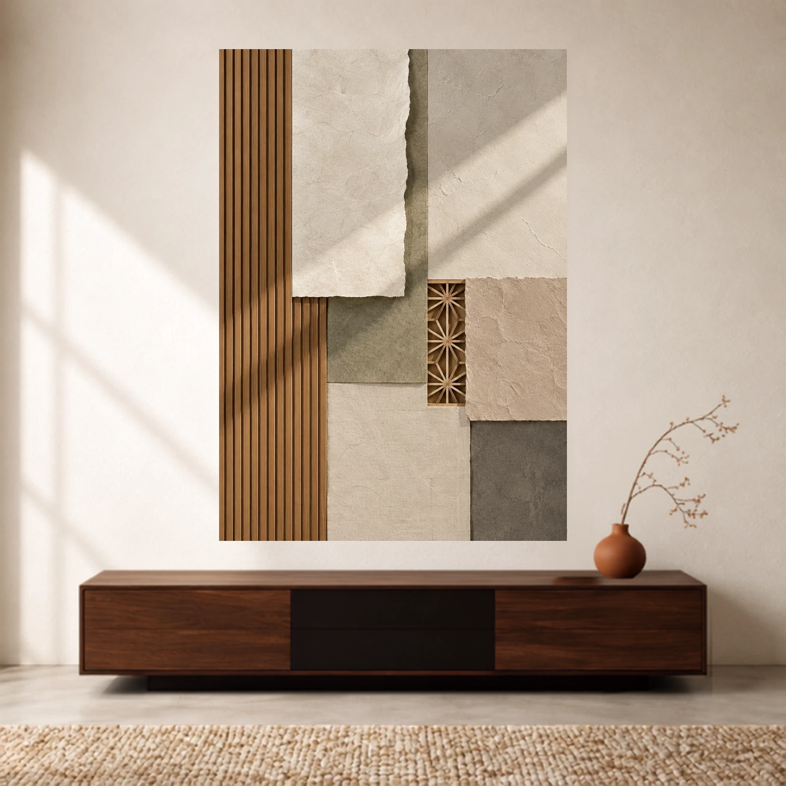
Japandi Textures combines long vertical lines with irregular-edged planes and a small patterned opening. Its limited palette does not make it visually empty: the slats provide a strong rhythm, while the overlapping shapes add smaller details to explore.
Try it beside a comparatively plain sofa, cabinet or desk. If your room already has slatted panelling, compare the two patterns carefully. They may echo each other attractively, but they can also compete. Look at the whole wall before deciding that matching motifs are automatically the best choice.
The design depicts surfaces and depth. It does not mean the supplied print contains wooden slats, raised plaster or torn layers. Check the selected print material separately from the texture illustrated within the artwork.
Japandi Moonlight: a curved focal point
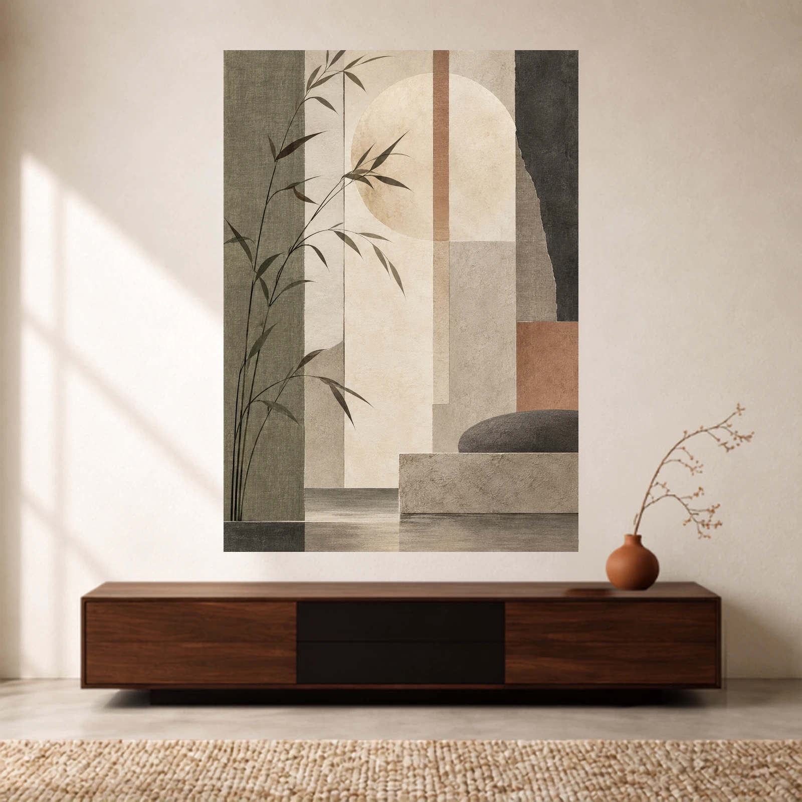
Japandi Moonlight gives you a rounded shape to compare with straight-edged furniture. The fine branches cross larger tonal areas, creating a different balance from the repeated slats in Japandi Textures.
Look at it first from your usual seat, then close up. If the circle reads clearly at a distance and the branches add detail when you approach, the composition may suit a room where you want one recognisable focal shape. Check its warm accent against your own textiles; the surrounding room in the preview is not part of the print.
Bamboo Quiet: a fuller botanical alternative
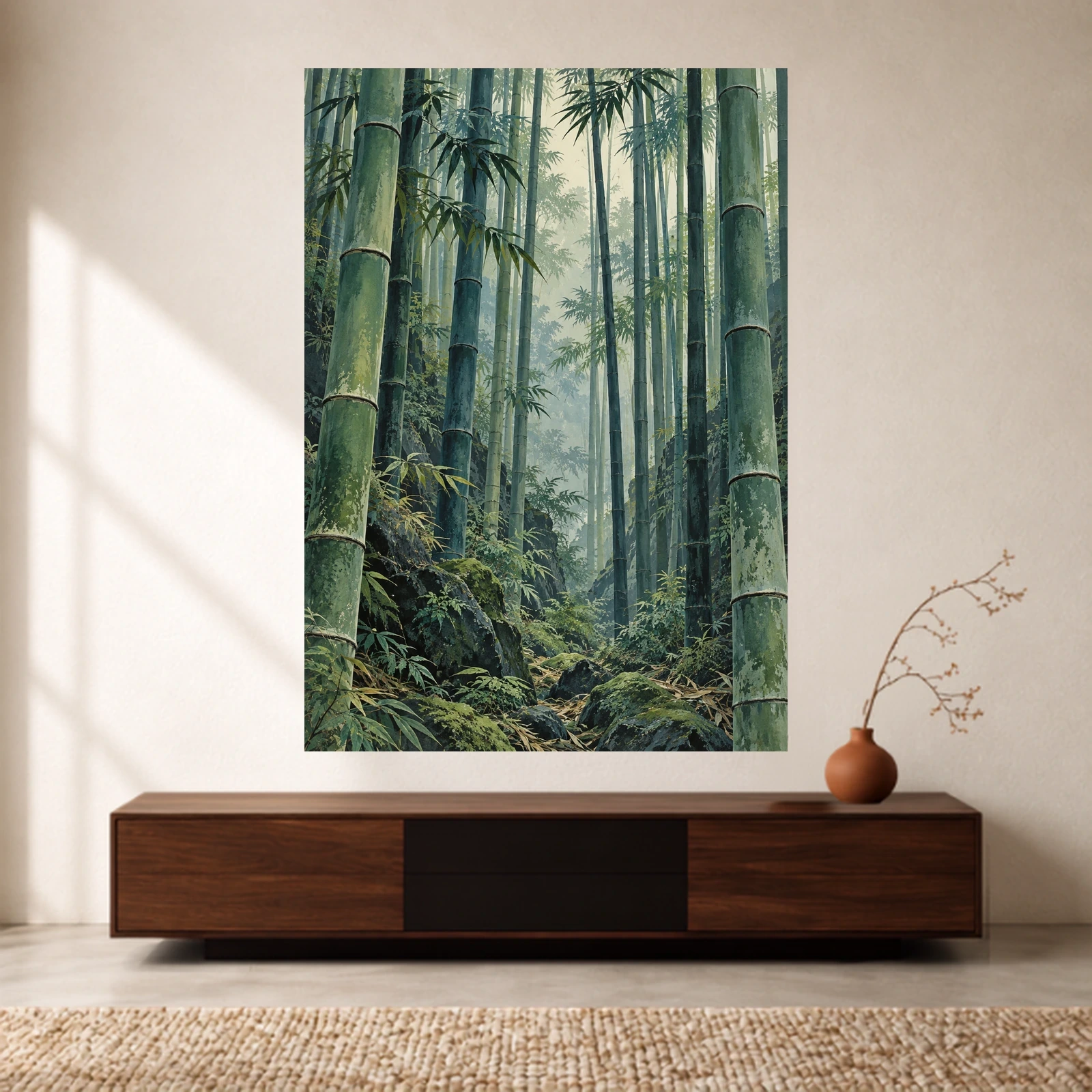
Bamboo Quiet is useful as a counterexample to the idea that every Japanese-inspired print must be beige or nearly empty. Its foliage and stems fill much of the image, with a lighter opening drawing the eye into the scene.
Choose it because you want that botanical detail, not because its name guarantees a quiet-looking wall. Beside patterned curtains, bookshelves or several plants, compare whether the scene adds the natural focus you want or makes the arrangement feel too full. For a broader shortlist, explore the Japanese and Zen wall art collection and judge each image individually.
Check the artwork against your room
Start with three things that will stay: the wall colour, the largest piece of furniture beneath the art and one nearby textile. You do not need to repeat every colour. Instead, identify one connection, such as the brown lines in a design beside a wooden cabinet, then decide whether you like the remaining contrast.
Next, compare the amount of detail. A room with plain walls and upholstery can accommodate a detailed scene differently from one with wallpaper, open shelving and patterned cushions. Cover the smaller decorative objects temporarily and see whether the print becomes easier to judge.
Finally, look at the shortlist in daylight and with your usual evening lamps. Screen brightness and room lighting affect your judgement; a digital preview cannot guarantee an exact match to paint, fabric or the delivered print. Our wall art colour guide offers a more detailed comparison method.
Choose scale and spacing before adding a second print
There are two separate decisions: how much detail sits inside the artwork, and how much clear wall surrounds it. A detailed picture can have plenty of space around its frame. A spare composition can still look crowded if it is squeezed between shelves and a doorway.
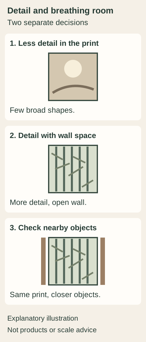
Measure the available wall, including nearby switches, lamps and shelves. Make a paper template of the complete display size, allowing for the frame or hanger where relevant. Place it temporarily using a method suitable for your wall finish, then view it from the sofa, bed or doorway. Use the wall art size guide for the measurement steps.
If you want a pair, begin with one shared feature: a palette, a line direction or a repeated shape. Compare the actual designs together before ordering. Two products from the same collection are not necessarily a matching set, and a pair does not need two identical compositions. Orderable products and quantities are determined on their individual pages.
Choose a frame, hanger or unframed print
A frame gives the image a distinct boundary. A wooden poster hanger emphasises the top and bottom edges and leaves the sides open. An unframed paper print lets you choose a separate frame or another suitable display method. None is compulsory for a Japandi-inspired room.
Compare the presentation colour with both the artwork and the nearby furniture. A dark border may connect to charcoal marks; a lighter wood-toned option may echo a cabinet. Similar names do not guarantee that two wood finishes will match exactly. Check the selected product’s available sizes, colours and included accessories before buying.
For the practical differences, read our UK comparison of framed prints, wooden hangers and unframed posters. It explains costs and display trade-offs in more detail, so this guide can stay focused on choosing the artwork.
Keep paper prints away from direct sunlight, radiators and persistently damp locations. The Canadian Conservation Institute’s paper-care guidance explains why light, heat and moisture matter. A frame does not make a print waterproof, and UV-filtering protection should not be assumed unless specified.
Common questions about Japandi wall art
Does Japandi wall art have to be beige?
No. Beige is one option. Muted greens, blue-grey, charcoal and warmer accents can also be considered. Compare the composition with your room rather than treating a colour name as a style certificate.
Are Japanese wall art and Japandi wall art the same?
No. Japandi describes an interior approach with Japanese and Scandinavian influences. Japanese art covers many histories, makers, techniques and subjects. These catalogue examples are contemporary designs, not evidence of traditional manufacture or Japanese origin.
Is a textured-looking print a textured object?
Not necessarily. In Japandi Textures, the slats, layered edges and surface effects are illustrated within the artwork. Read the material specification if a physical texture is important to you.
Should I buy one large print or a pair?
Test the complete display outlines on your wall first. One print offers a single focal point; a pair gives you another relationship to balance. Neither is automatically better for a small room, and both need room around nearby objects.
Your shortlist before ordering
- Choose the composition you prefer: structural planes, a circular focal form or a detailed botanical scene.
- Check its palette beside your actual wall and furnishings.
- Separate illustrated texture from the physical print material.
- Measure the complete display and test its outline.
- Confirm the selected size, presentation, accessories, current price and delivery details on the product page.
Start with the Japanese and Zen collection, then narrow it to the two or three images that work best with your own room. The most useful choice is the one whose shapes, colours and level of detail you still enjoy after comparing it at your normal viewing distance.
Ordering from the UK
The UK range is unframed matte paper prints on 200gsm fine art paper, supplied without a mount or hanger, plus assembled Classic framed prints in A4, A3 and A2. Metal posters and desk mats are made in our Pakistan studio and are not sold in the UK.
Prints are A-series: A4 is 21 x 29.7 cm, A3 is 29.7 x 42 cm and A2 is 42 x 59.4 cm. Classic frames use the same sizes.
Prints are made to order and delivered in 5–10 business days. Delivery costs £5.95, or is free on orders of £55 and above. Pay by credit or debit card. Prices are in pounds.
Fixed-design prints can be cancelled for any reason within 14 days of delivery. Custom prints made from your own image cannot be cancelled. If an order arrives damaged, defective or incorrect, tell us within 30 days and we will replace or refund it.
Shop matte paper prints or Classic framed prints, or print your own artwork. Delivery and returns are set out in full on their own pages.
Next step
Turn the guide into a finished piece.
Use the guide to pick a ready design, or send your own artwork for studio review before production.